It’s REVEAL DAY!!! Our primary bathroom remodel is DONE and I’m still in awe that this is our bathroom now. Come on inside and take the full tour!
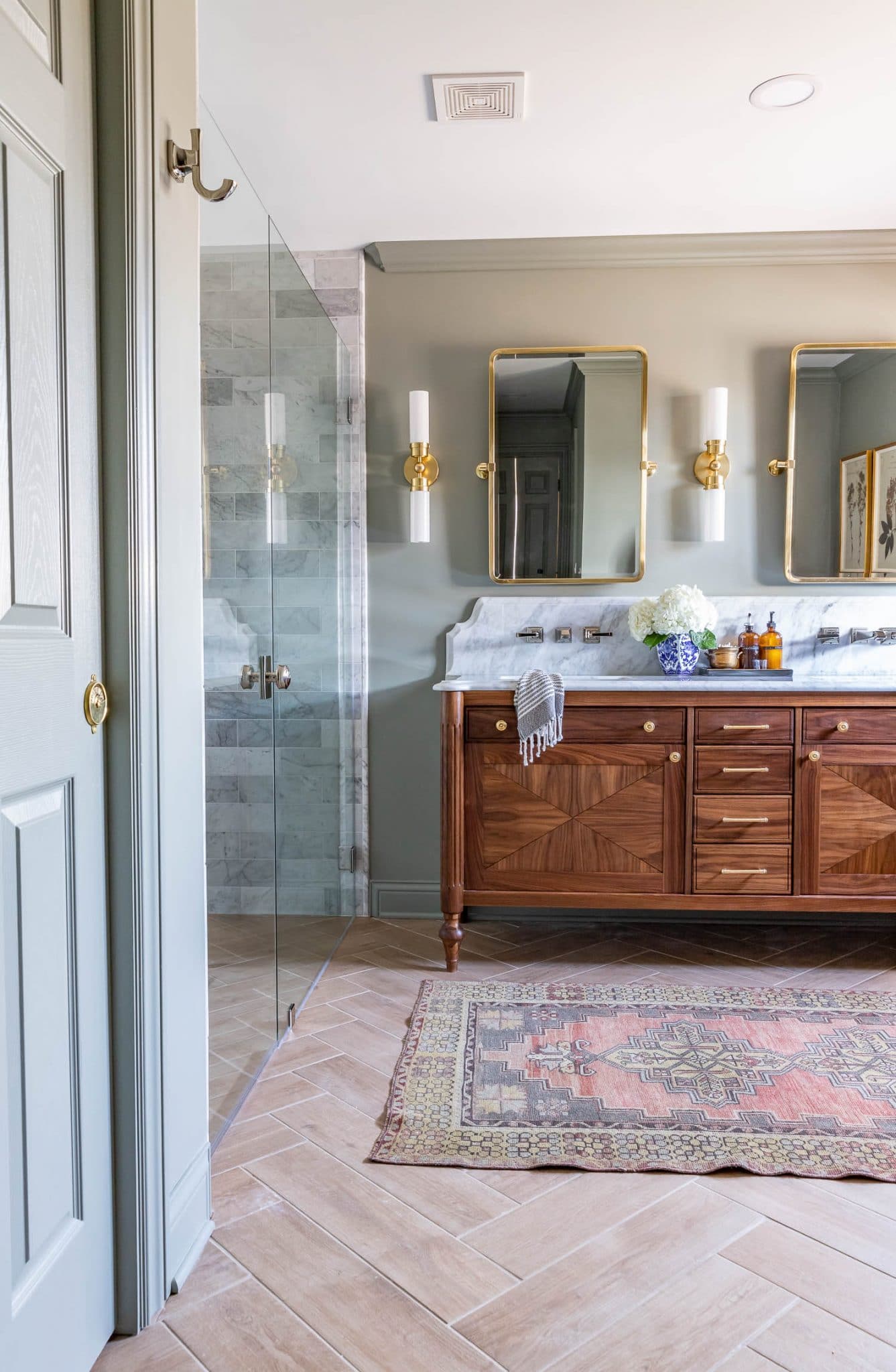
Big, big thanks to our amazing sponsor, American Standard for partnering with us on this bathroom remodel – it would not have been possible without them and I’m thrilled they could help bring our vision to life! These elegant, polished nickel fixtures elevate our bathroom and bring everything up to date, yet remain timeless and classic. For over 140 years, American Standard has been one of the most trusted brands in the kitchen and bath industry with high-quality, high-performing, stylish products. All of our plumbing fixtures are from their beautiful Town Square S collection – I love its classic, elegant design – it’s timeless, traditional, and a bit formal.
Watch the Video!

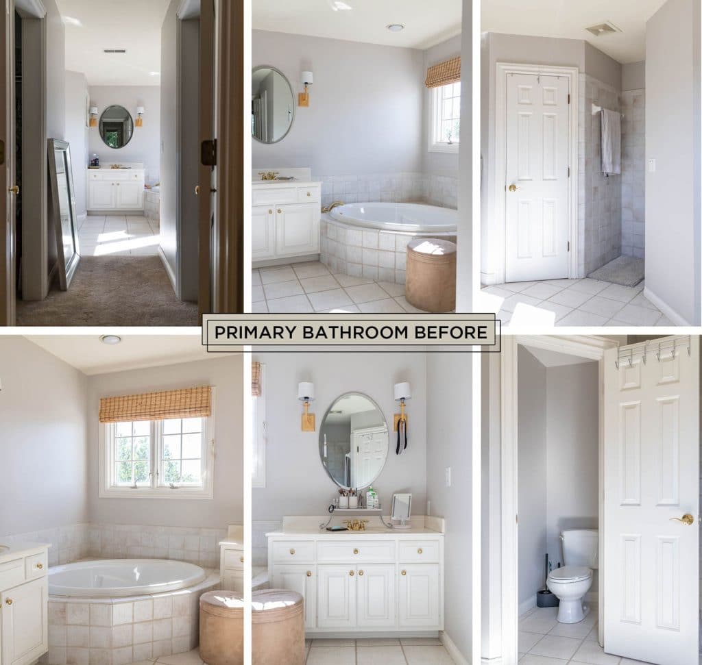
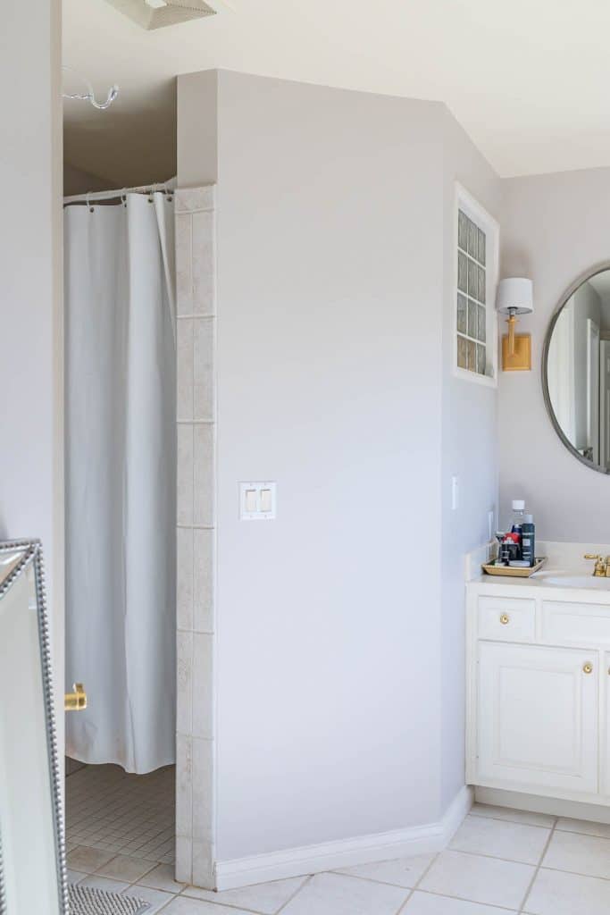
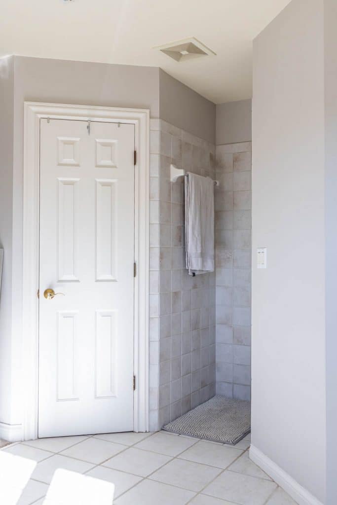
Hard to believe our bathroom used to look like this, just a few months ago…
Hire Out or DIY?
As you may know, we do A LOT of DIY around here, but for this remodel, I was happy to hire out the lion share of the work for a few reasons. When we remodeled our guest bathroom, we did all the work ourselves and learned a ton of new skills, but it was very slow-going. For this remodel, we had a shorter timeline, but a bigger budget, so we chose to pay the pros for their expertise, experience, and to have the convenience of getting the job done more quickly.
Bathroom Remodel Progression
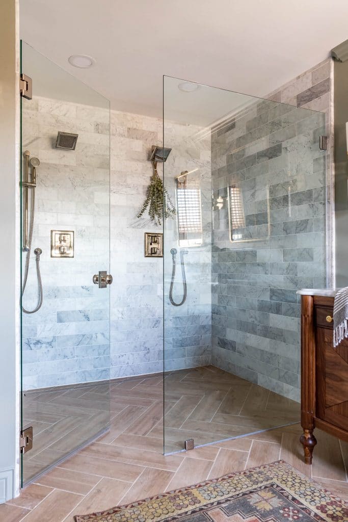
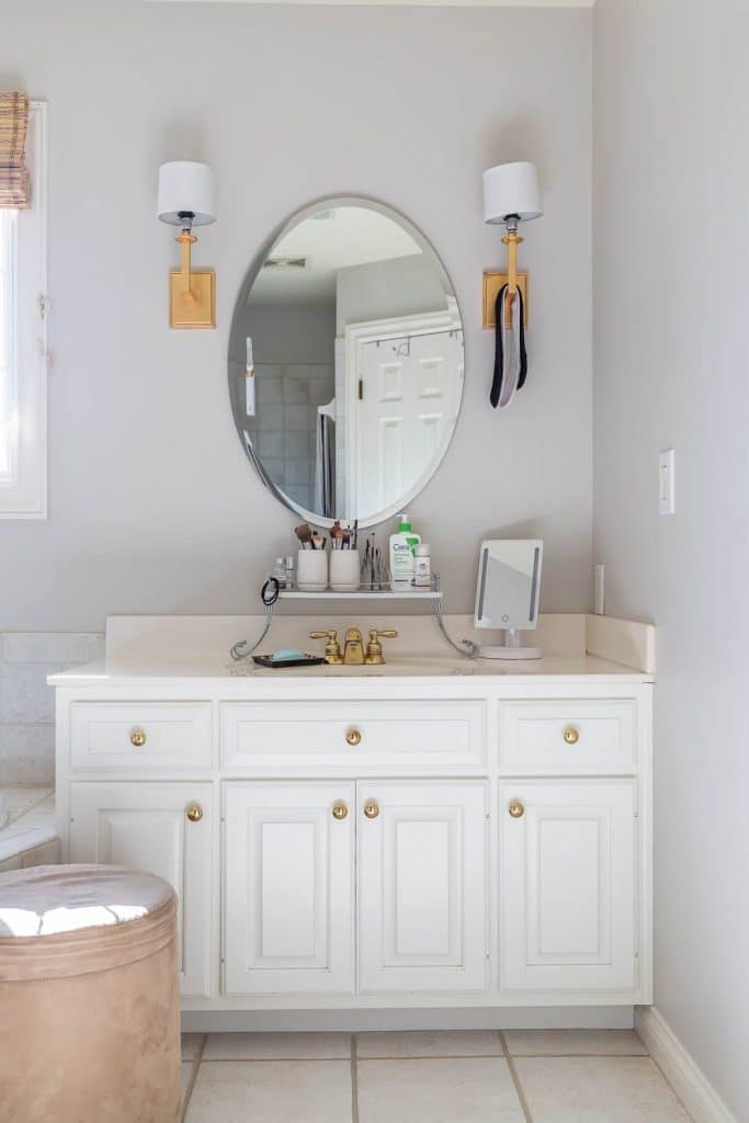
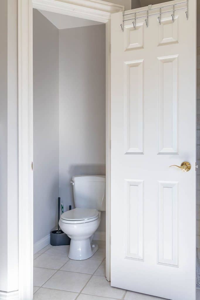
I’m so pleased with how this transformation turned out! We got rid of the giant, unused tub and traded it for a double shower (definitely the right choice for us!), squared off the water closet and replaced the swing-out door for a pocket door, and replaced the smaller, separate vanities with a beautiful double vanity. These changes not only improved the flow of the room and made it feel more spacious, but increased the functionality of the overall space.
We documented the entire process from start to finish, so if you’d like to see how our bathroom remodel unfolded, check out these posts:
- Bathroom Remodel Design Plans
- Demo, Framing, Rough-In Plumbing and Electrical
- Insulation, Drywall, and Priming
- Tiling!
- How To Install A Toilet and Bidet Seat
- Vanity Countertop Install
- DIY Black Walnut Double Vanity
The Double Vanity Area
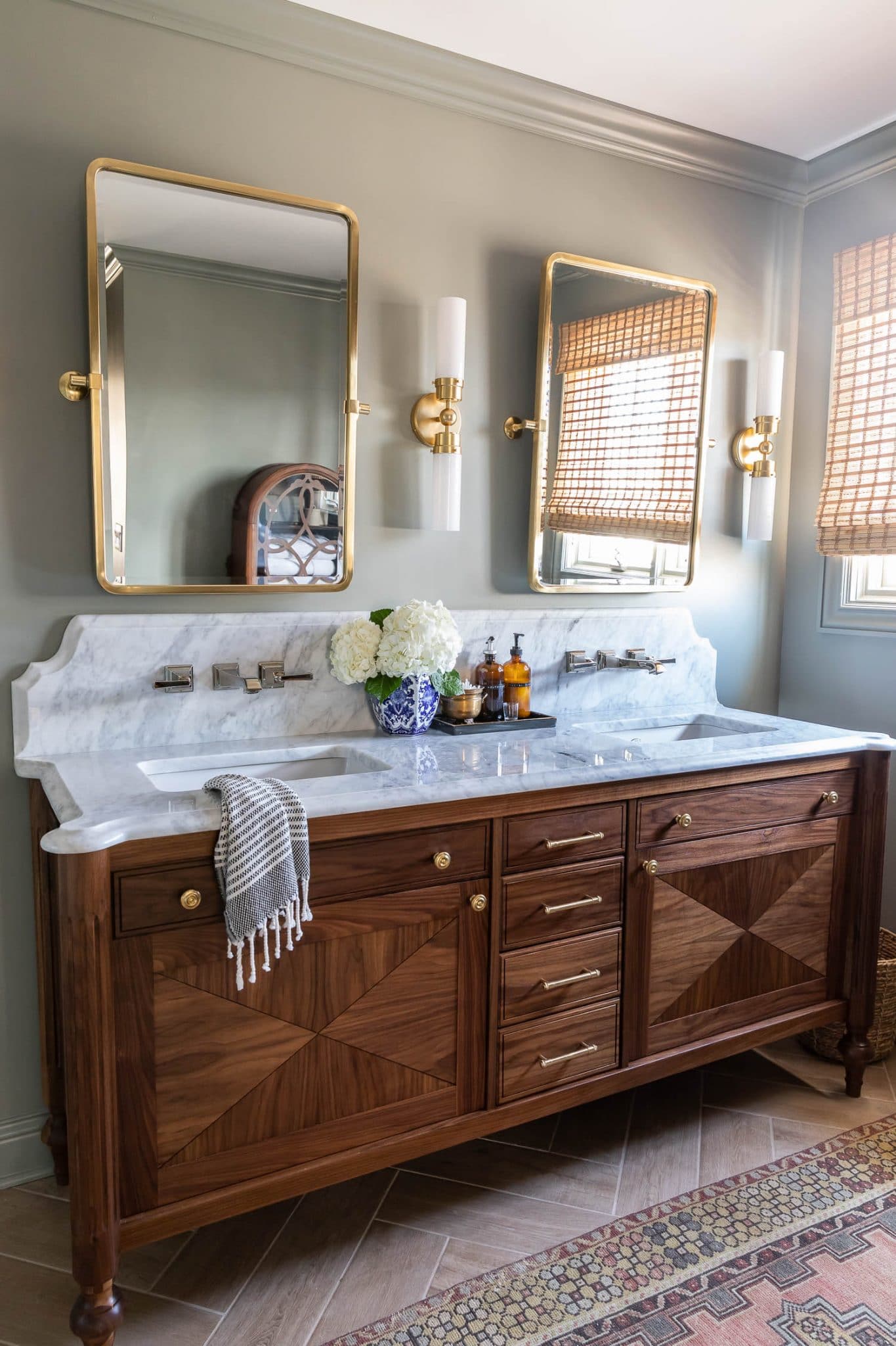
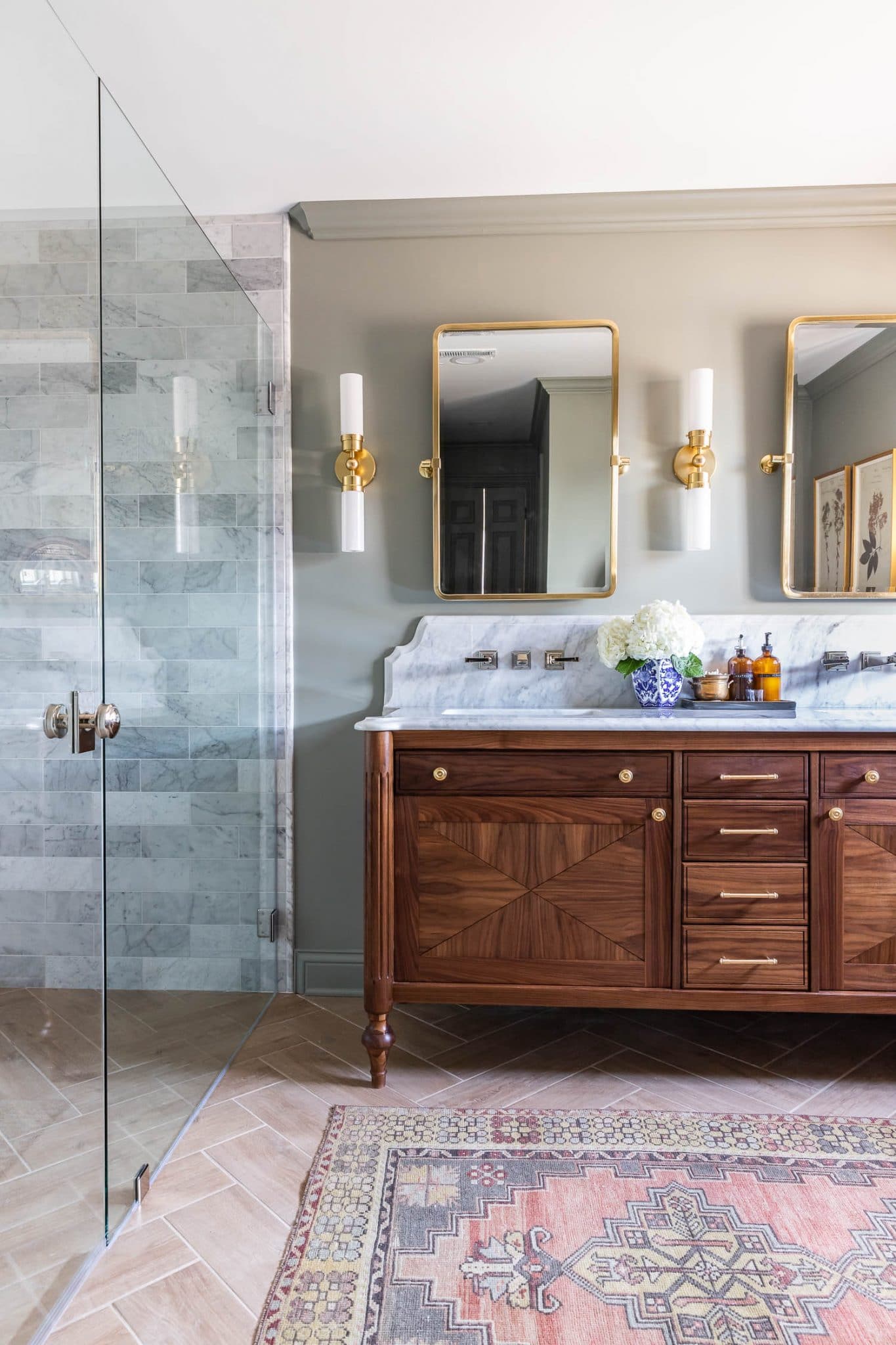
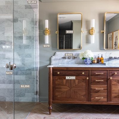
Ever since we bought our French Colonial home, I’ve been so inspired by Louis XVI furniture, so I designed our bathroom vanity with that in mind. I added the fluted detail to the turned legs and took advantage of that stunning black walnut wood grain by book-matching the doors. If you’d like to build this vanity for own home, grab the step-by-step PDF plans here!
Town Square S Wall-Mounted Faucets and Under-Mount Sinks
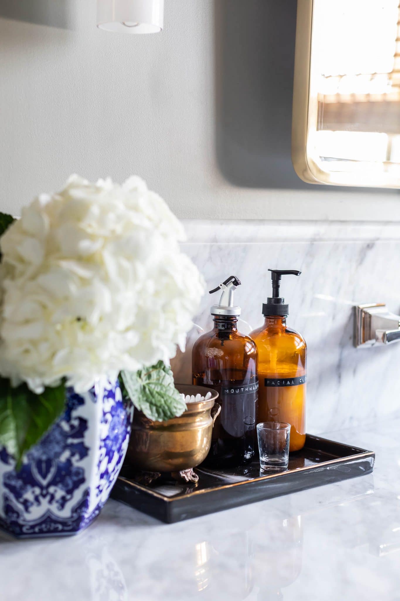
For the countertop and backsplash, we had our local stone fabricator cut it from a marble remnant we had left over from our kitchen remodel. The curved backsplash with a pretty ogee edge is the perfect backdrop for these polished nickel wall-mounted faucets. I love a wall-mounted faucet – they make cleaning the countertop so much easier, but they can be a little tricky to plan for because there isn’t a set standard. How far above the sink should the faucet be? Does the neck arch up or down or come straight out from the wall? What is the thickness of the flooring and the height of the vanity? There are many things to consider when planning for a wall-mounted faucet. I built our vanity a bit taller (36 inches tall), which is a more comfortable height for us. And after much deliberation, I finally decided that 4-6 inches from the spout to the top of the counter felt just right. The white under-mount sinks are also from American Standard.
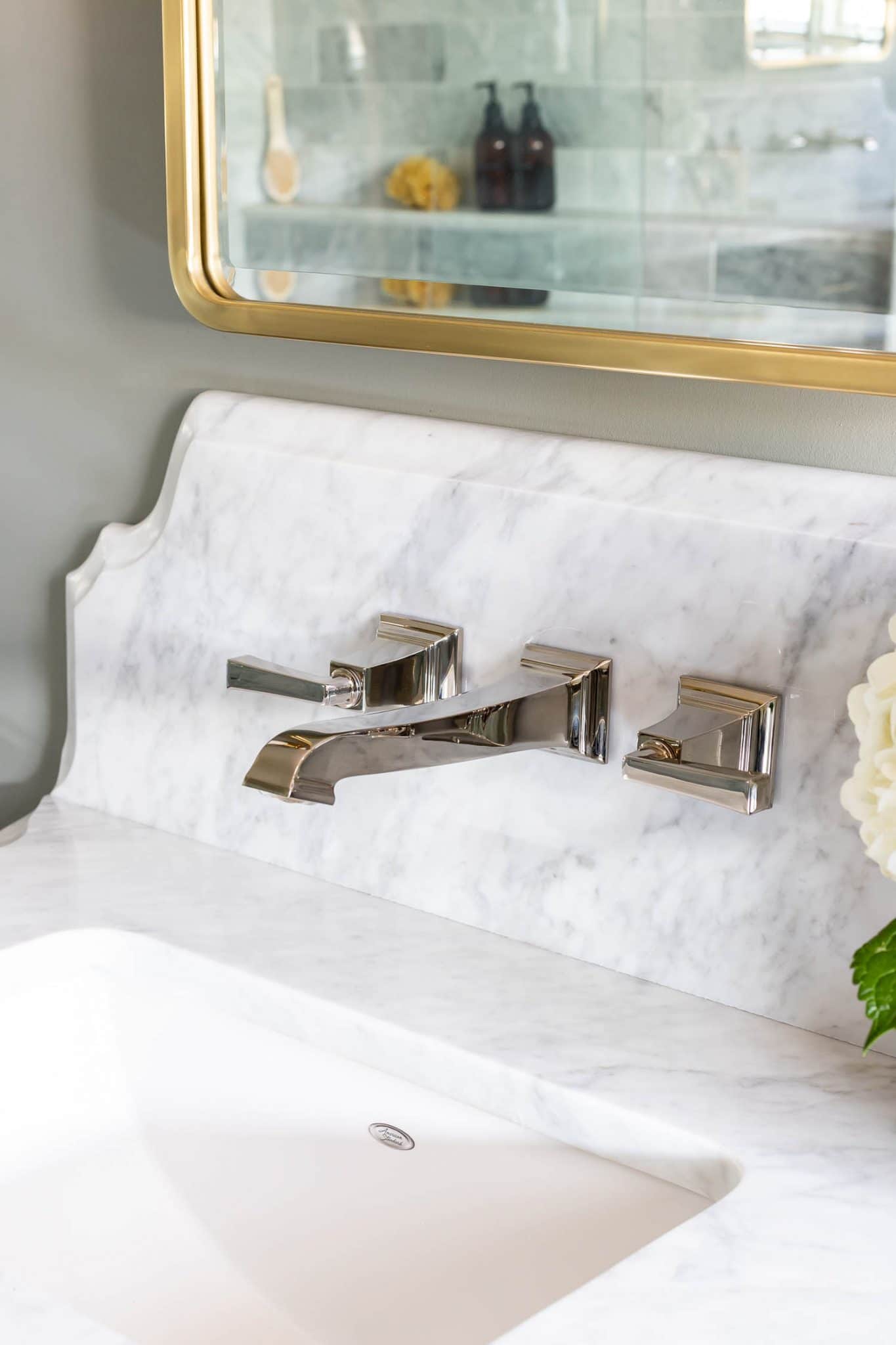
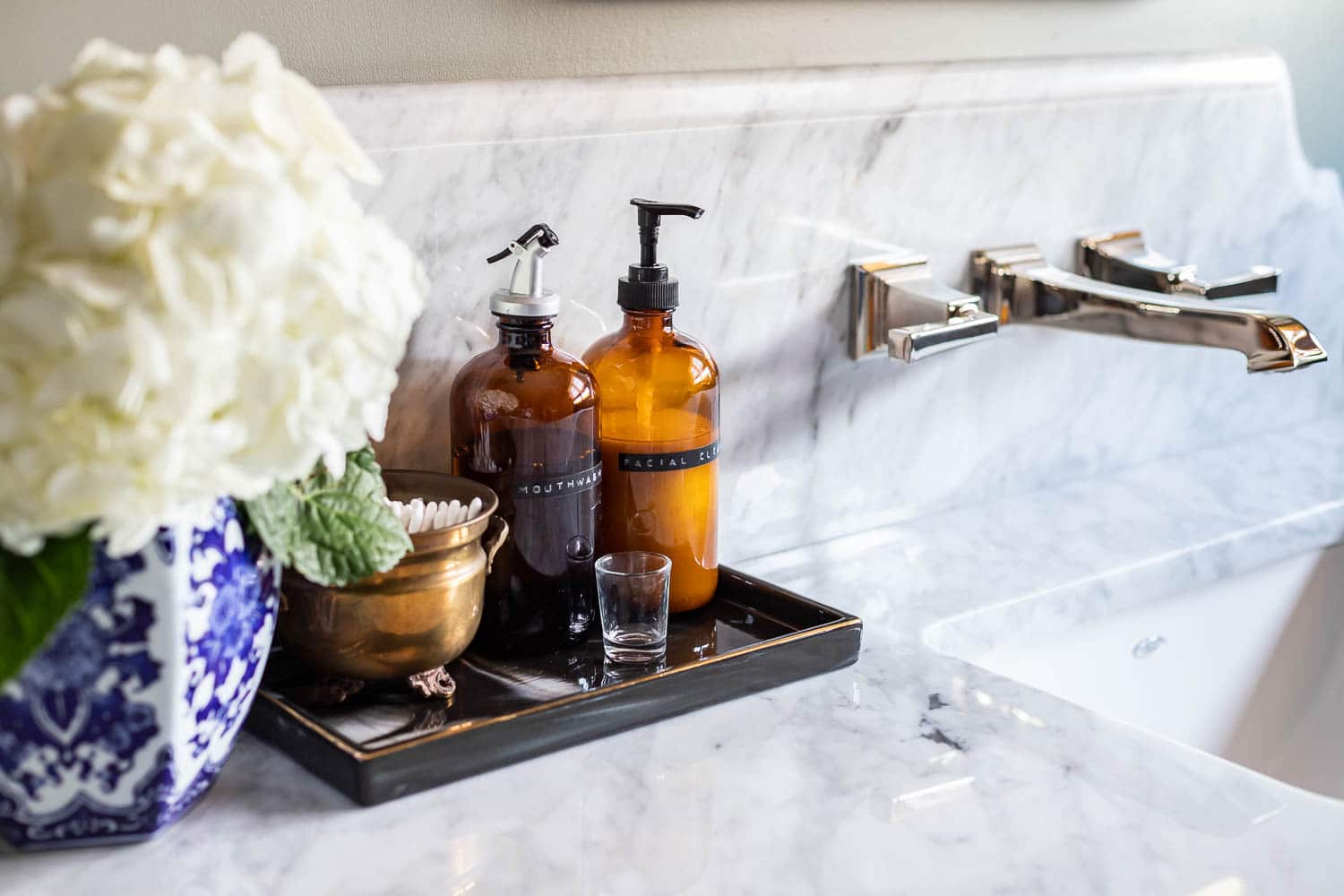
While I love mixing metals in a space, I try to keep the more permanent fixtures on the classic side (polished nickel is just timeless!) and go trendier with the things that can easily be switched out, like light fixtures and mirrors. Polished nickel has a warmer tone than chrome, which makes it perfect for pairing with a brass finish. The mirrors and sconces have an aged brass finish and the pulls and knobs on the vanity are an unlacquered brass, which will develop a beautiful patina as it ages.
The Curbless Double Shower
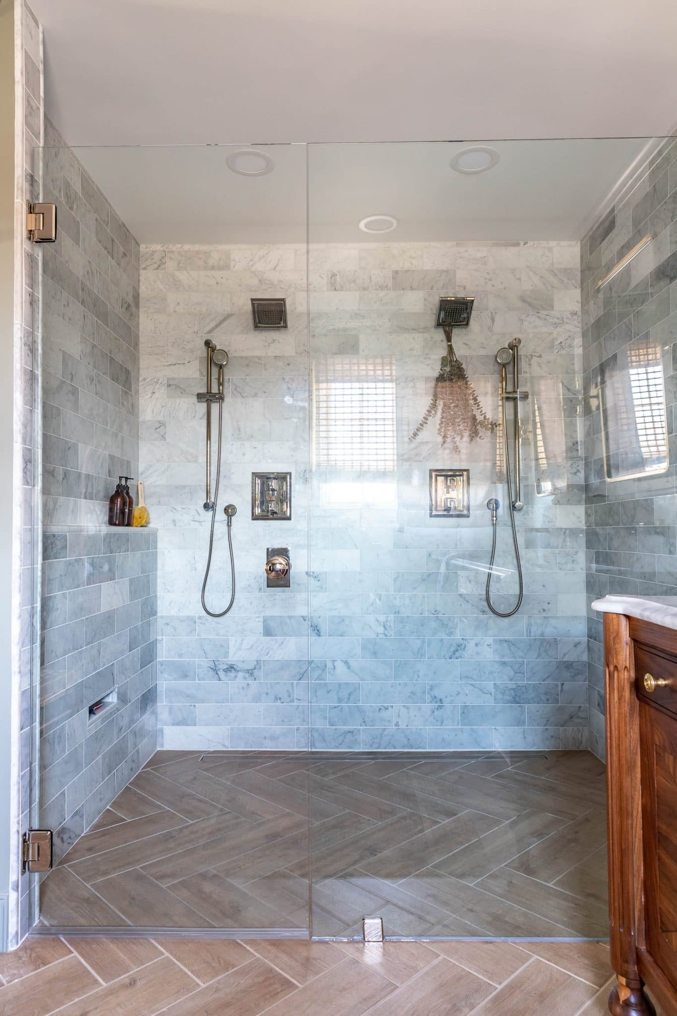
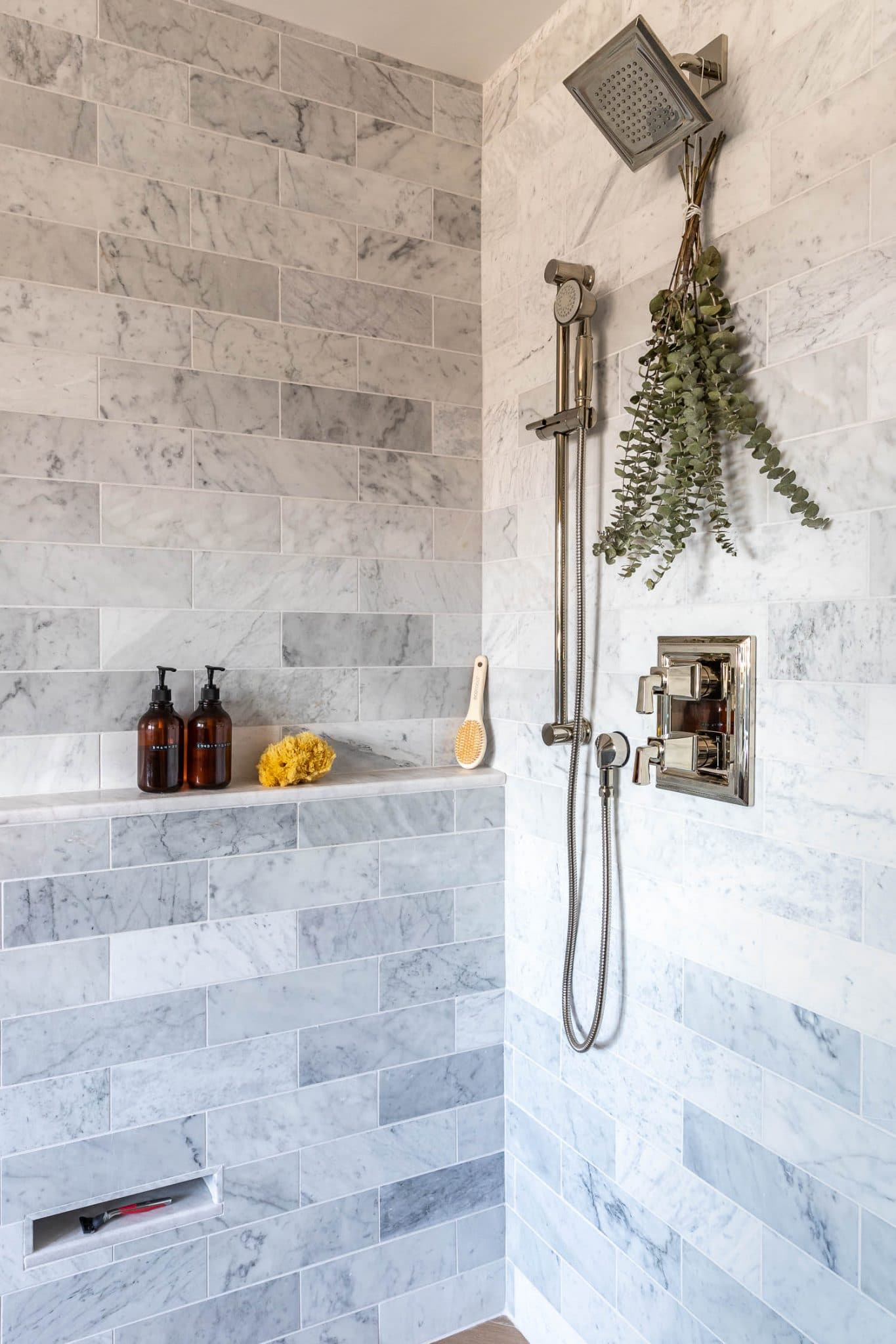
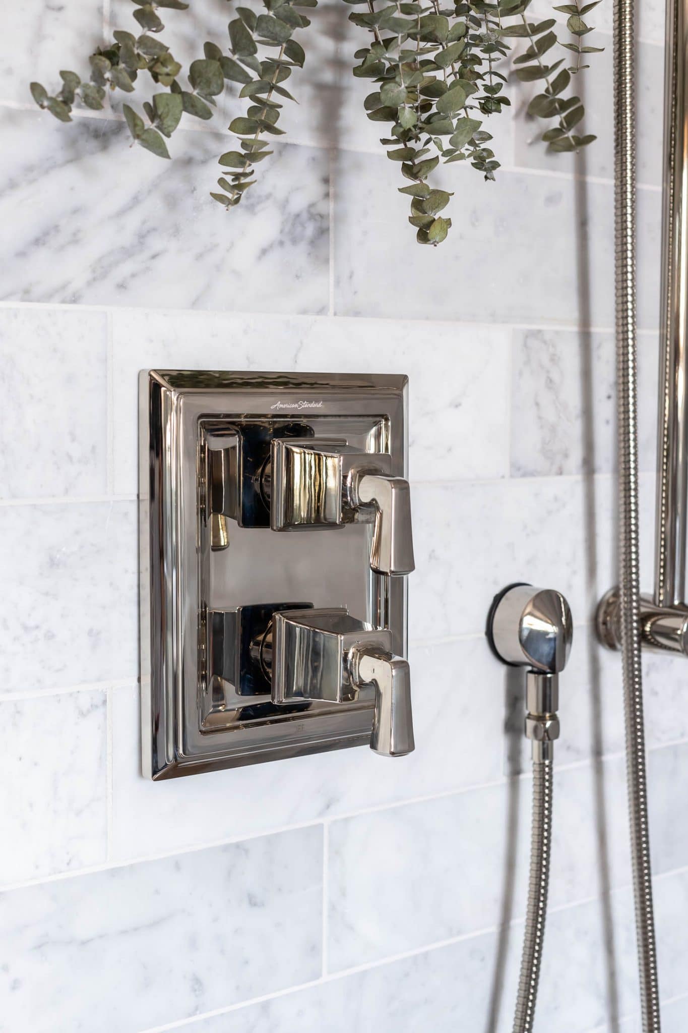
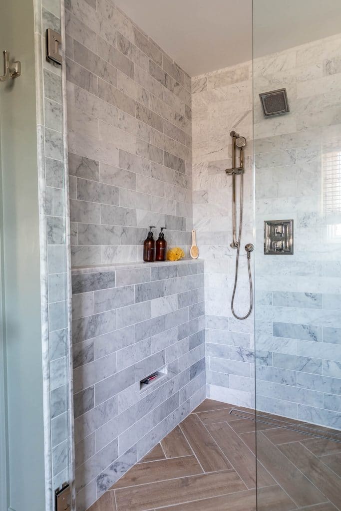
Having a double shower was one of those “dream items” on our list and we’re so grateful that we were able to make it a reality. We chose the Town Square S 2-Handle Integrated Shower Diverter Trim Kit and installed a handheld shower head on each side that adjusts and slides easily on a 30-inch bar. These handheld showers also make cleaning the tile much easier!
A Shower Niche vs. Shower Ledge?
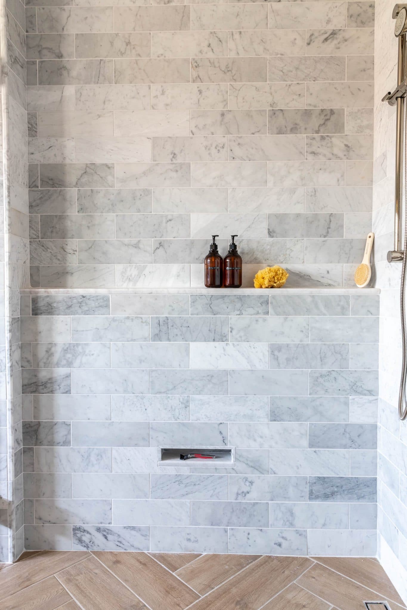
Shower niches are wonderful, useful things to have, but they’re usually placed in plain view, where you’re ultimately putting your toiletries and crusty bar of soap on full display. I prefer for that stuff to be out of sight, so I agonized on where to place our shower niche. Then I had a lightbulb moment and considered putting in a shower ledge instead of a niche! Shower ledges are starting to grow in popularity in the design world (this image from one of my favorite designers is what sold me!) and I actually came to love this option the more I thought about it. I think a shower ledge is superior to a niche because they’re easier to frame, easier to tile, and easier to keep clean. They also allow for any size shampoo bottles to fit. However, we did add a narrow foot hold niche down below, to prop up a leg for shaving.
The Water Closet
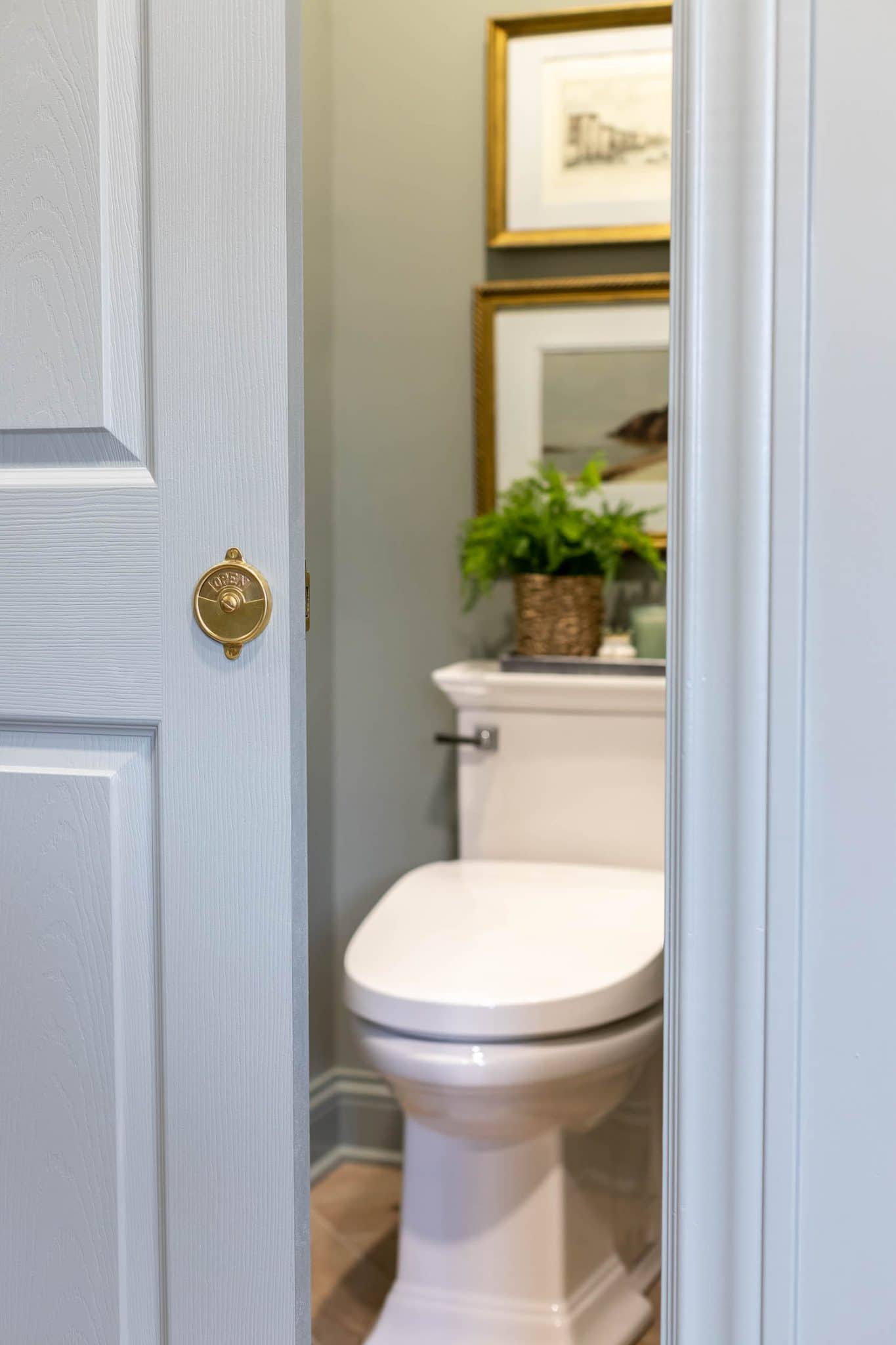
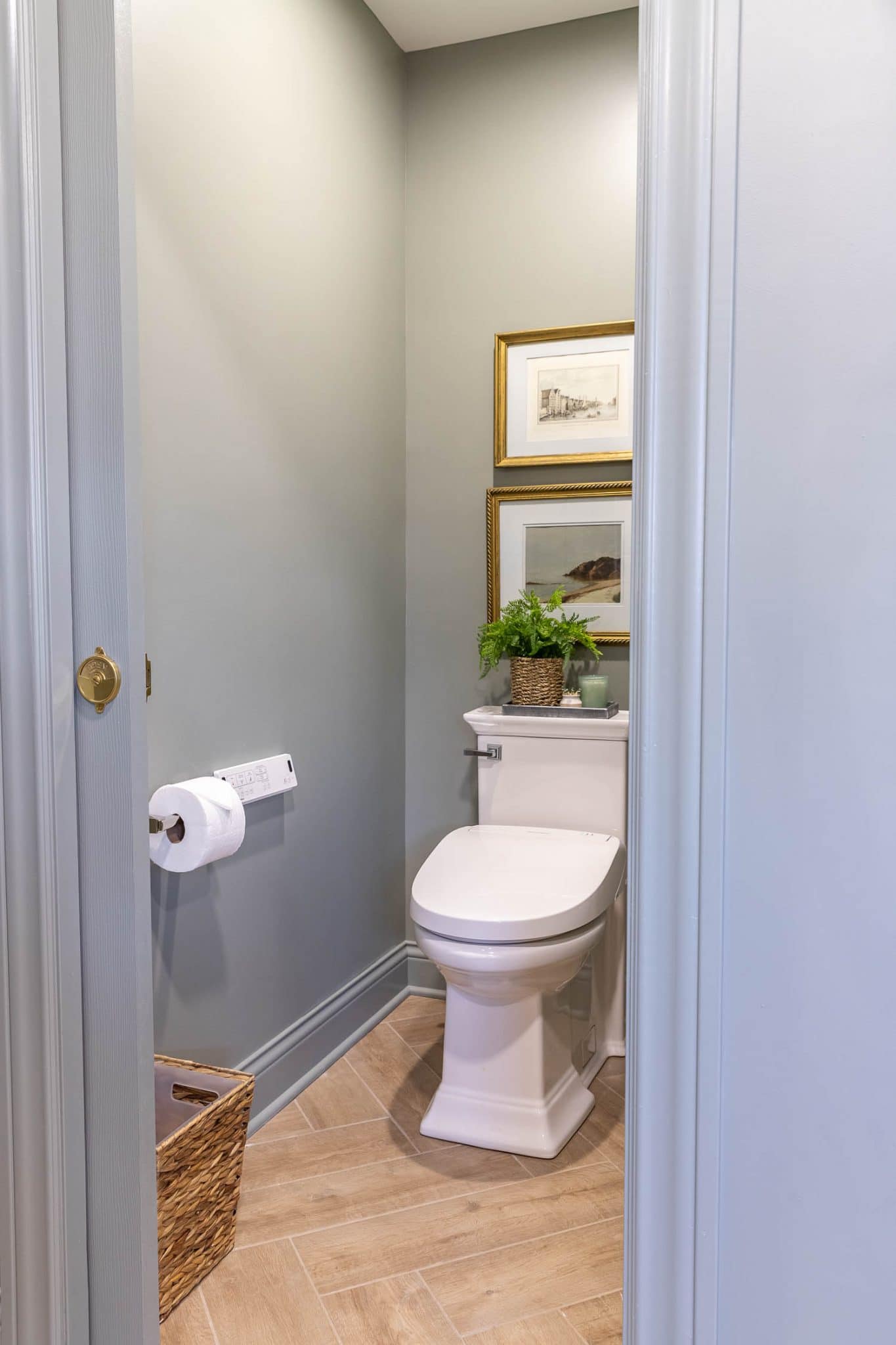
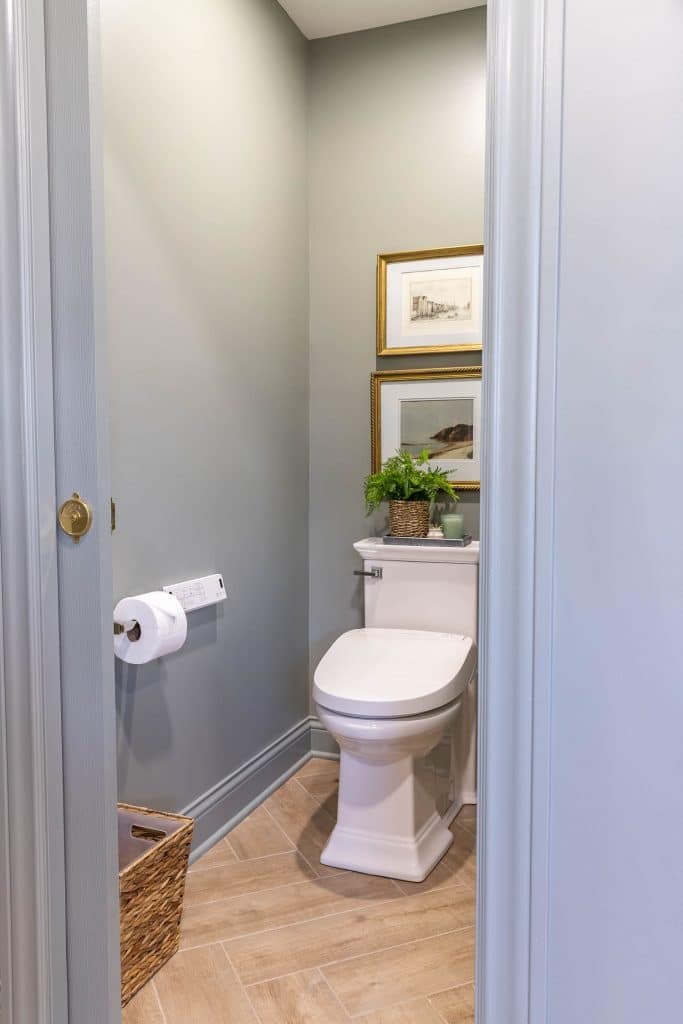
Keeping the toilet in a separate water closet was a non-negotiable for Adam, so we squared off the room and gained a little more space in doing so. We also replaced the swing-out door with a pocket door, which saved even more space.
Town Square S One-Piece Toilet and Advanced Clean Electric SpaLet Bidet Seat
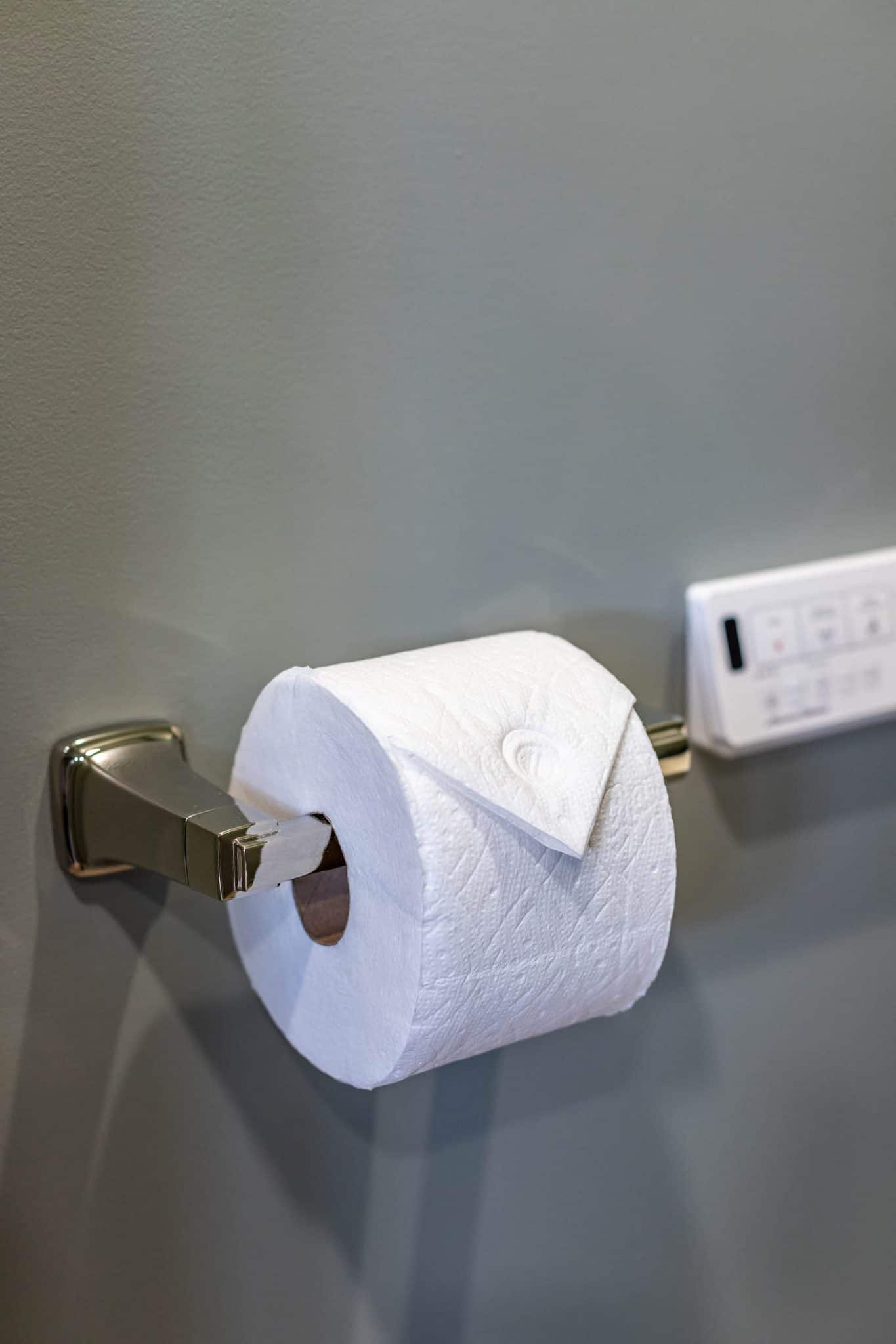
We installed the Town Square S One-Piece Toilet with the Advanced Clean Electric SpaLet Bidet Seat. This bidet seat easily replaces a standard toilet seat, as long as there’s a power source nearby. By the way, we made a how-to video on that project – if you don’t want to undergo a full bathroom remodel, you can easily switch out the toilet or add a bidet seat and still upgrade your bathroom experience. It’s an easy home improvement project that any homeowner can tackle in just a few hours.
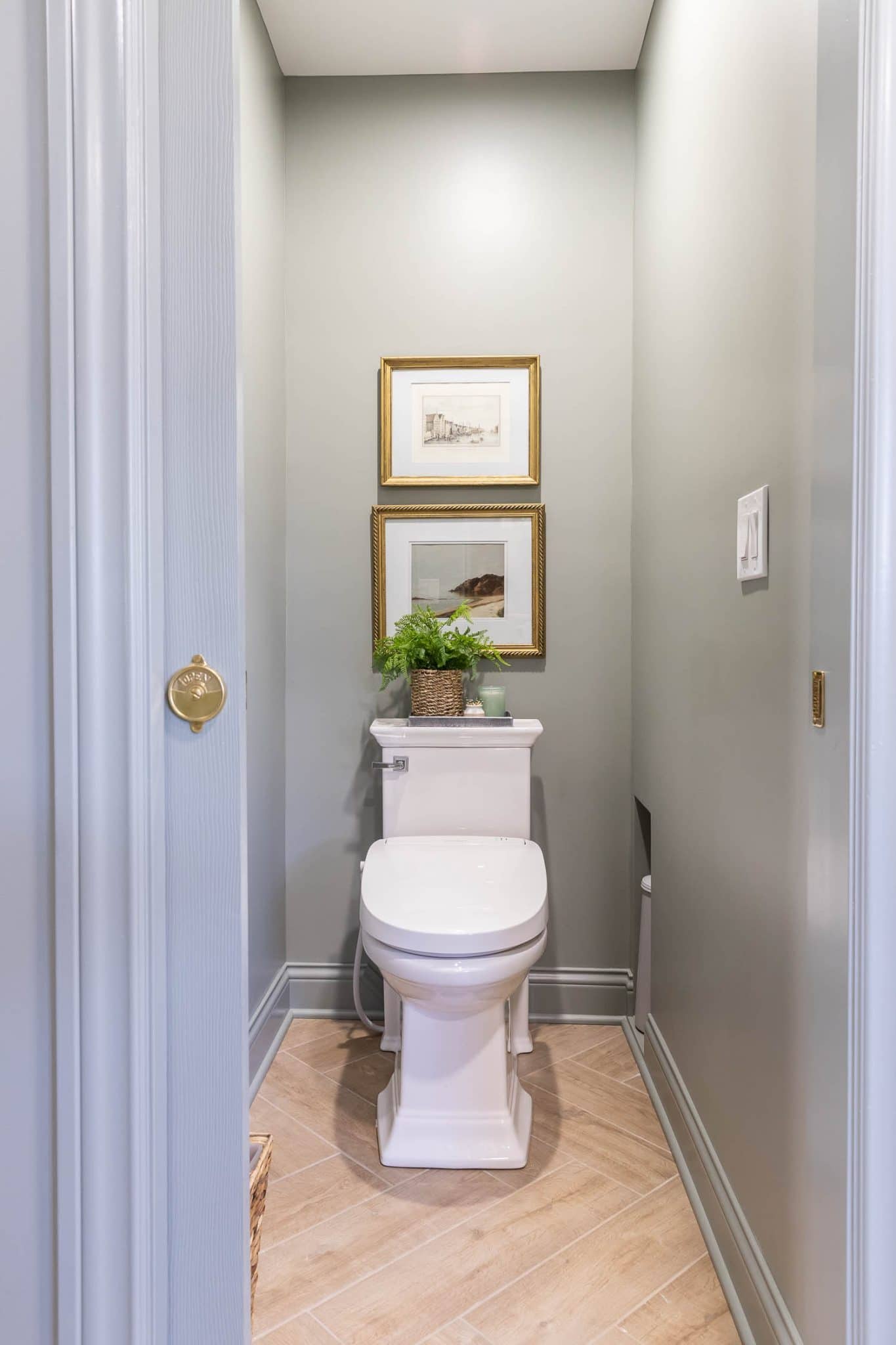
This beautiful one-piece toilet has a skirted base, which once again, makes it easier to keep clean (cleanliness in a bathroom is paramount, am I right?). It’s a chair-height toilet with an elongated bowl, so it’s super comfortable. Adding that bidet seat makes this throne fit for a king! The bidet seat has self-cleaning dual nozzles for front and back cleansing, a warm air dryer, and a heated seat (which is my favorite!) You can adjust the spray strength, the water, dryer, and seat temperature as well as the direction of the spray nozzles. Super fancy!
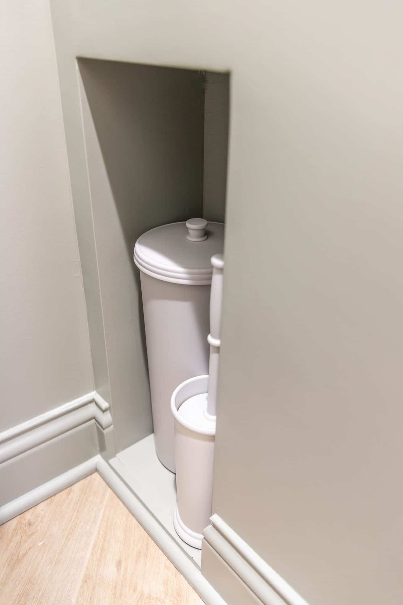
The Ingenious Toilet Brush Nook!
Remember how we opted for a shower ledge instead of a niche? This made the wall between the shower and the water closet double the thickness, which allowed us to frame out a little nook for the toilet brush and plunger. No precious floor space is wasted in this tiny room and those nasty things are hidden away! How clever is that?!
Trim Work
When the trim guys didn’t show up, I got stuck doing all the trim work in here, which actually ended up being a good thing because I really enjoy the meticulousness it takes to do finish carpentry. I was able to take my time and had a lot of fun testing my skills. I have a couple of crash course videos on how I install baseboards and crown molding saved to my Instagram highlights if you’re interested.
What Paint Color Is That?
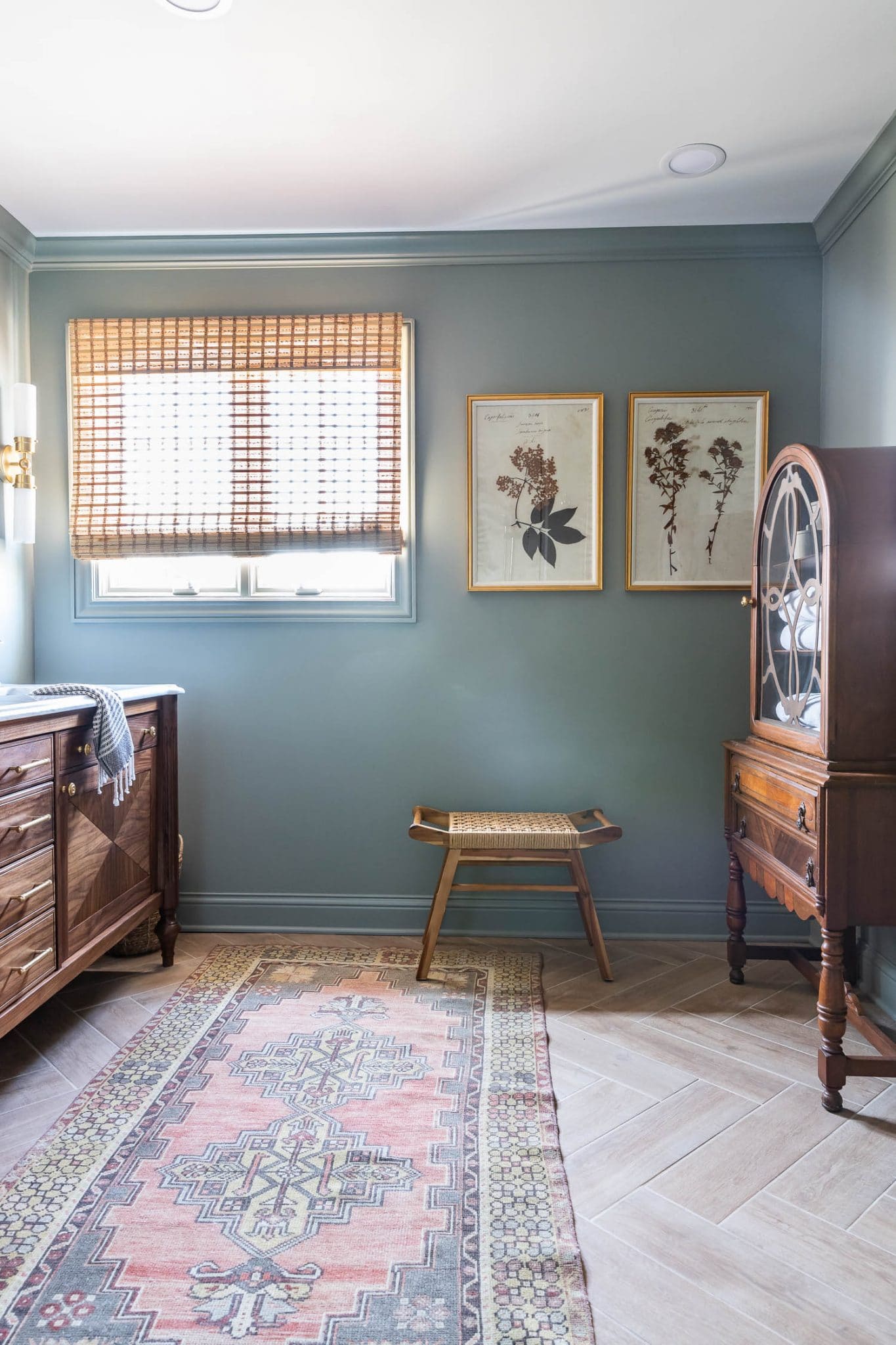
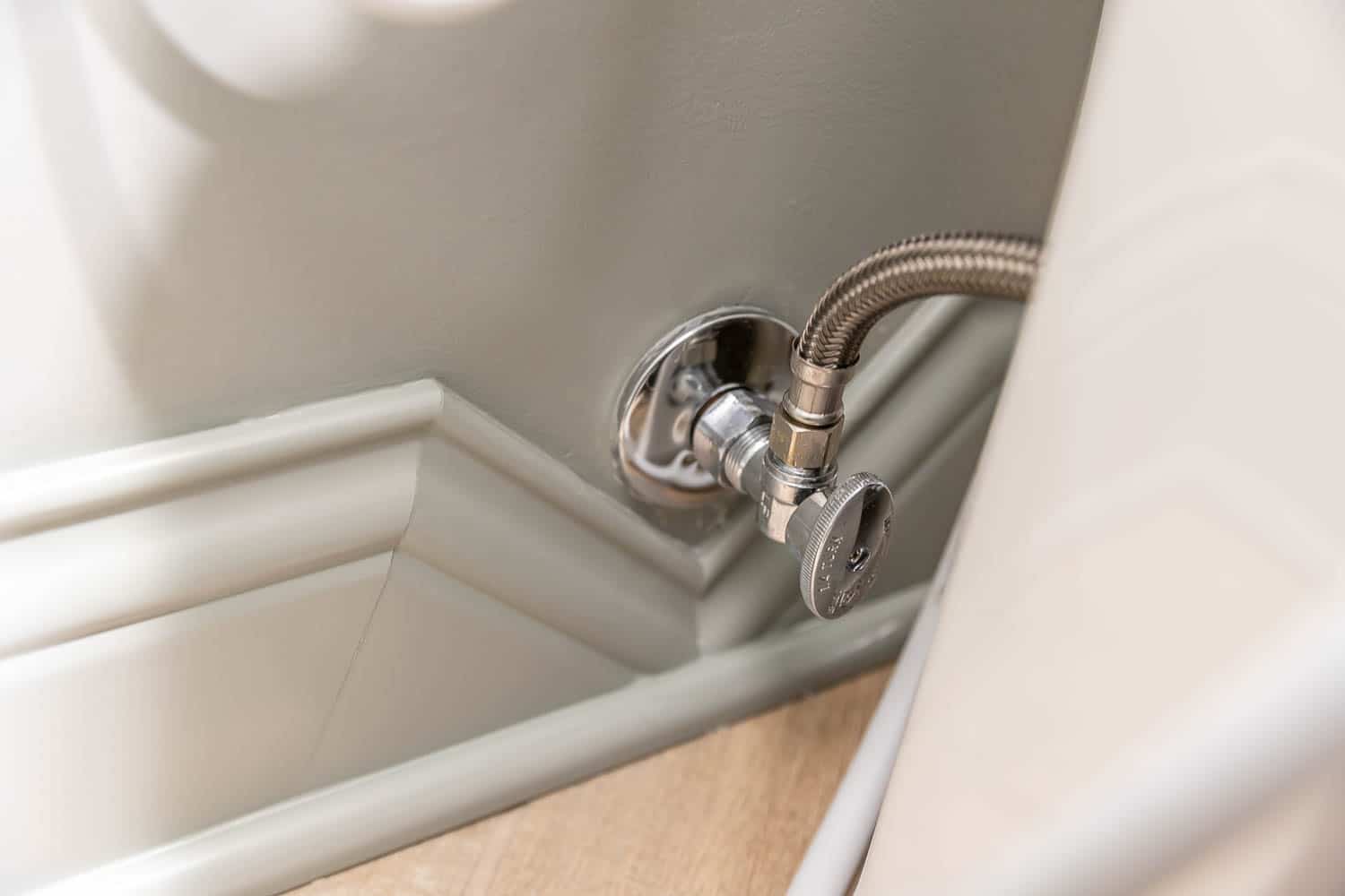
As for the paint color – I had a lot of questions about it! It’s called “Pigeon” by Farrow & Ball. At first, I was going to go with my tried-and-true “White Dove” or “Swiss Coffee,” but at the last minute, I decided to go a little moodier in here, and I’m so glad I did! I wanted an ambiguous color – a color that you can’t really put your finger on, and depending on the time of day and what kind of light is in here, “Pigeon” looks gray, green, beige, and even a little blue at times. This color is perfect for this space – it ties into the marble tones and plays off of the black walnut vanity so well. It’s interesting, a bit moody with the perfect amount of saturation, yet still calming.

Side-by-Side Before & After
And just for fun, it’s nice to see a side-by-side before & after comparison. I don’t realize just how far we’ve come until I look back to see where we started!
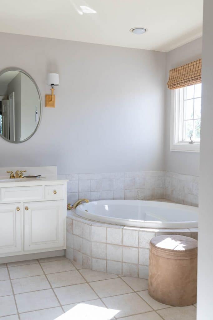
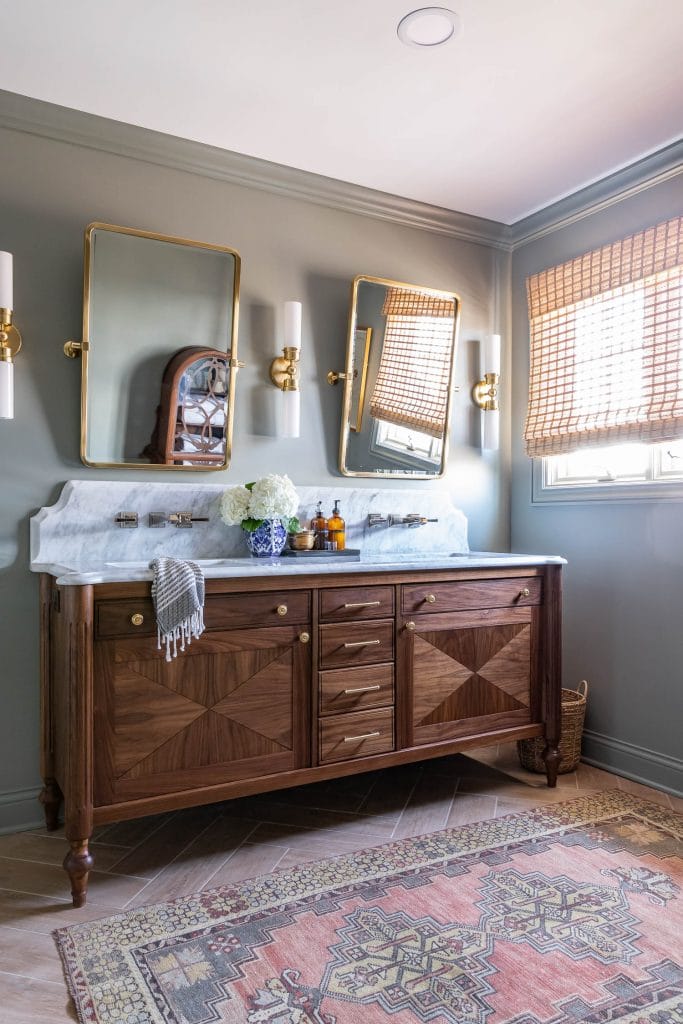
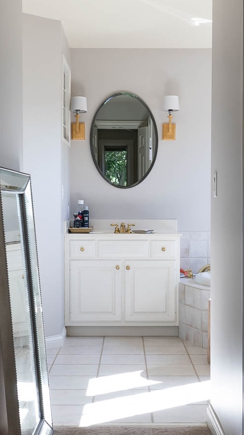


A ton of time, thought, and effort went into this bathroom remodel and we’re so happy with how it all turned out! The new layout was a huge improvement – it makes the room feel more open and airy. Now, the flow and function makes more sense with how we live in and use the space everyday. We don’t miss our tub at all and feel it was a worthy sacrifice for this gorgeous double shower. These elegant American Standard finishes brought our bathroom up-to-date, while still maintaining a classic look that will be stylish for years to come. Designing and building the vanity was a labor of love for me and it not only increased our storage space, but became a showstopper piece for our bathroom.
Thanks so much for following along with our primary bathroom remodel – I’ll be back to share a budget breakdown with a full source list soon, but if you have any questions or comments in the meantime, feel free to drop them below!
Sources
- American Standard Town Square S Collection (shower trim kit, faucets, robe hook, toilet paper holder)
- American Standard Handheld Shower
- American Standard Town Square S One-Piece Toilet
- American Standard Advanced Clean Electric SpaLet Bidet Seat
- American Standard White Under-Mount Sinks
- Wall Color: Pigeon by Farrow & Ball, matte finish
- Trim Color: Pigeon by Farrow & Ball, eggshell finish
Jen, this bathroom remodel is beyond stunning! Every little detail is gorgeous and so well thought out! Thank you for sharing all you do! You’re a huge inspiration!
Superb job, love the detail in accessories; especially the water closet wall cubby for the brush and waste bin. Huge shower…. party time.
Bathroom is beautiful! Well thought out.
Is there anything you either regret doing or would do different ?
Thanks David and great question! If I had to choose, maybe I’d put the shower heads a little closer together. As a rule of thumb, you want at least 36 inches in a shower, but with our double shower heads, we feel like it’s still a little too far apart. Just personal preference, though.
Beautiful job! Not only well conceived, but also well executed. Great attention to detail. We are planning to update our main bath too, but are struggling whether to jettison the large double jacuzzi tub for a double shower. We wonder about no tub in the main bath for resale. Thoughts?
Thank you, Tom! We never once used our bathtub and haven’t missed it one bit. My realtor friends say that as long as there’s a bathtub somewhere in the house, not having one in the primary shouldn’t hurt resale value. Luckily, we have a bathtub in the kids’ bathroom. My renovation/builder friends tell me they tear out about 90% of the bathtubs in favor of a larger shower when remodeling. I guess it would come down to personal preference – I’m hoping the right buyer will come along and fall in love with the home, even without a bathtub in here!
Simply beautiful! The wood cabinetry really adds warmth to the room.
We are working on planning out our master bathroom in our renovation and also want a shower kind of like yours. What are the dimensions of your double shower as well as the main part of the bathroom?
Hi Meghan,
Our shower is 5′ x 7′ and the rest of the bathroom is about 10′ x 8′. Hope that helps – good luck on your bathroom remodel!
Your shower is BEAUTIFUL and the vanity is exquisite! Everything is PERFECT! Love the AS fixtures!
I am in the process of building and our bathroom has a large shower that could be a wet room, however, my husband hates the idea. He just wants a big shower. It is not huge either and a tub in the floor area would crowd the vanity which he wants to run the length of the bathroom. My husband loves his shower time…lol… It is a 6 by 6 approximately, given a few inches more that I don’t take into account because of tile and backer board.
In your opinion, how big does the shower area have to be to include a tub and shower on the wall?
Thanks so much!
Thank you, Jane! Our shower is 5’x7′ and we feel it’s a bit too tight to include a bathtub with the double shower. However, if we went with just 1 shower, I think our current footprint would be enough space to include the bathtub. Hope that helps – good luck with your remodel!
LOVE the vanity and the glass bathroom door is absolutely stunning! I’ve always wanted one (as well as black showerhead for that matter) but I am somewhat reluctant because of the scale buildup. Is that an issue for you/how do you deal with that?
Love this!
Were you able to stick to your original budget?
Beautiful and well thought out bathroom!
I was wondering what’s the height of your shower ledge? We use Costco shampoo so we were thinking 40”, do you think it’s too short?
Our shower ledge is 41″ high and feels like a very comfortable height!